Widget Layout
In Anatomy of a Widget we looked at a weather widget we built. Now let's take a deeper dive on how the layout works.
Layers
Widgets are layed out based on a grid system of 12 units by 12 units. All sizing values are relative to these grid units. Layers are drawn back to front, so the first layer specified is the furthest back and newer layers are put on top. Just like a painter laying down layers of paint on top of each other.
Let's take a look at our weather widget.json from before.
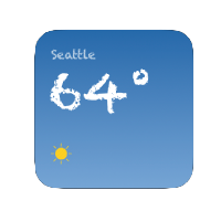
You can see in the styles section we define a background gradient and then our first layer is a full width and full height background using that gradient. Because we defined it first, it will be the furthest back layer and other layers will be drawn on top of it.
{
  "rows": [
    {
      "height": 12,
      "cells": [
        {
          "width": 12,
          "background_color_style": "background_gradient"
        }
      ]
    }
  ]
}
Let's look at the next layer but elide some of the content.
{
  "rows": [
    {
      "height": 1
    },
    {
      "height": 1.5,
      ...
    },
    {
      "height": 0.25
    },
    {
      "height": 3.5,
      ...
    },
    {
      "height": 1.5
    },
    {
      "height": 3,
      ...
    },
    {
      "height": 1.25
    }
  ]
}
Here's how those rows translate into the finished product:
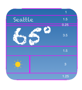
Each layer must have its rows add up to height 12 and all the cells in a row must add up to width 12.
Note that not all widgets are 1:1 squares, therefore the width unit is not always the same size as the height unit.
Padding
You might have noticed our use of padding in a few spots. There are two ways to move content around in a widget: empty cells and padding. Empty cells are great for coarse movement and laying things out relative to the entire widget's content. While padding helps with fine-grained movement of content. We used empty cells to give the city text some vertical breathing room by putting a row with "height": 1.5 above it. We can see the city name itself uses padding to shift the name off of the left edge a little bit:
{
  "height": 1.5,
  "cells": [
    {
      "padding": 1.25,
      "width": 12,
      "text": {
        "data_ref": "weather_city",
        ...
      }
    }
  ]
},
Padding is nice when you have the rough layout in place and you just want to nudge things a direction without changing other heights and widths in the layer. Padding is "paid for" by the current cell. The cell boundary stays in place and the content is padded within the cell.
You might have noticed that the padding in this example is only adding some breathing room to the left side but not the top and bottom. This is because by default text has a min_scale_factor set to 1.0. We'll cover min_scale_factor below.
Text
Text is one of the main content elements in a cell. You can see the full text object schema here, but at a minimum you need to specify one of either string for an inline string or data_ref for a referenced string from the data object. Other than the string itself, you may want to change it's size from the default of 18.
Text objects also support some dynamic sizing. In certain situations a string might be too long to render at the desired size, however shrinking the font size a little bit might make the full string renderable. This "auto-sizing" is disabled by default because min_scale_factor is set to 1.0 by default. However, if you wish to let the text shrink to accommodate longer, dynamic strings, you can change this to a value less than 1.0. min_scale_factor is a multiplier on the size of the string. In other words, if you specify min_scale_factor of 0.5 on a text object with size 18, the text is allowed to shrink to 9.
Image
Image is another cell content element. Images can be configured by either url which specify an inline image URL or by data_ref which looks up the URL from the data object using the string provided.
Images can be optionally masked with a circle mask by passing mask: circle on an image object.
Images are fetched and rendered with the image center point positioned at the cell center point. Images are scaled to fit their width to the cell width. Aspect ratio is preserved and if images exceed their top and bottom, those portions of the image are clipped.